Home /
Expert Answers /
Economics /
the-graph-illustrates-the-marginal-abatement-cost-mac-and-marginal-damage-cost-curve-mdc-of-pol-pa166
(Solved): The graph illustrates the marginal abatement cost (MAC) and marginal damage cost curve (MDC) of pol ...
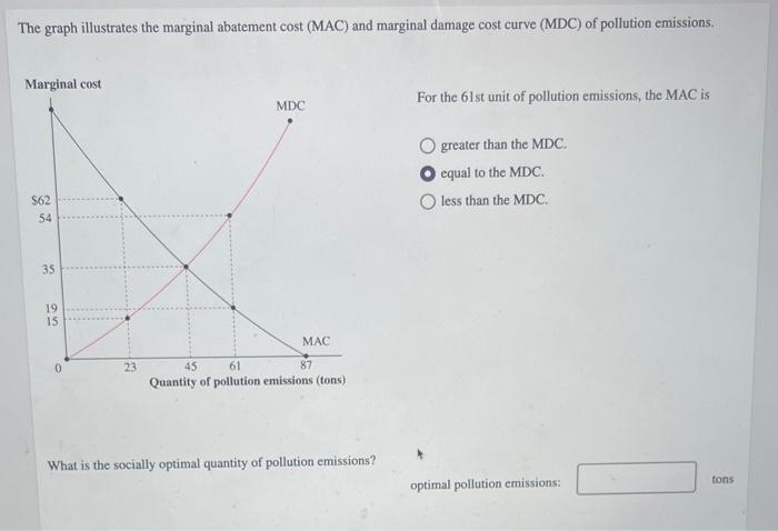

The graph illustrates the marginal abatement cost (MAC) and marginal damage cost curve (MDC) of pollution emissions. For the 61st unit of pollution emissions, the MAC is greater than the MDC. equal to the MDC. less than the MDC. What is the socially optimal quantity of pollution emissions?
A market will produce of pollution emissions. less than the socially optimal quantify. the socially optimal quantity. more than the the socially optimal quantity
Expert Answer
Answer 2- Ans1 (option 3) ess than the MDC Explanation- at the 61st unit of pollution emission the ma