Home /
Expert Answers /
Economics /
the-following-graph-shows-the-aggregate-demand-ad1ad1-and-aggregate-supply-as-curves-for-a-hypot-pa901
(Solved): The following graph shows the aggregate demand (AD1AD1) and aggregate supply (AS) curves for a hypot ...
The following graph shows the aggregate demand (AD1AD1) and aggregate supply (AS) curves for a hypothetical economy with full-employment output of $11 trillion.
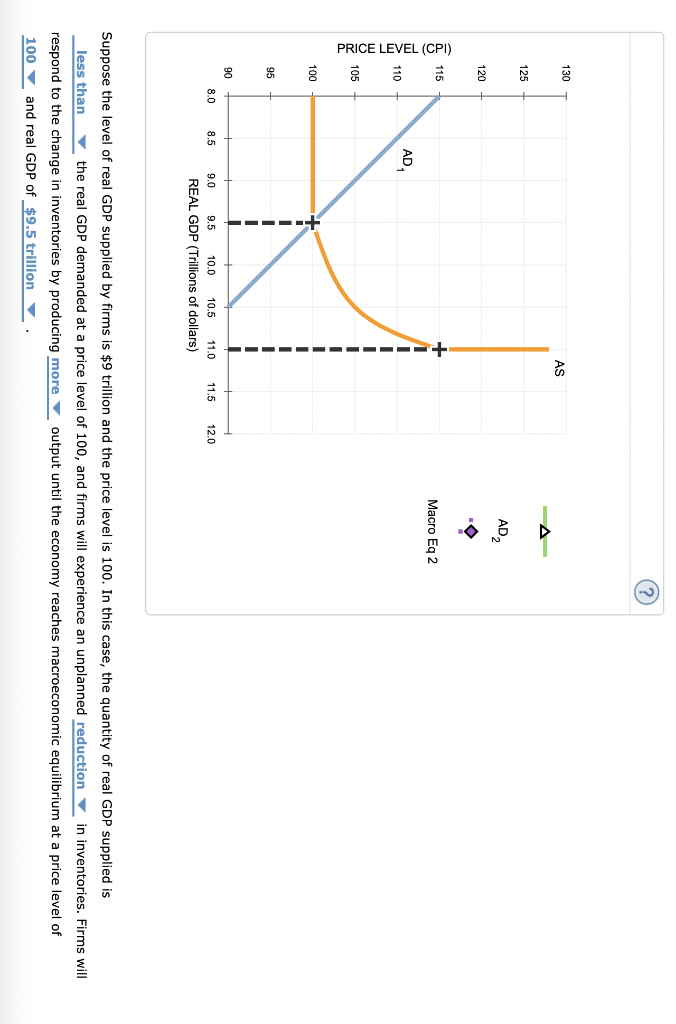
Suppose the level of real GDP supplied by firms is \( \$ 9 \) trillion and the price level is 100 . In this case, the quantity of real GDP supplied is the real GDP demanded at a price level of 100, and firms will experience an unplanned in inventories. Firms will respond to the change in inventories by producing output until the economy reaches macroeconomic equilibrium at a price level of and real GDP of
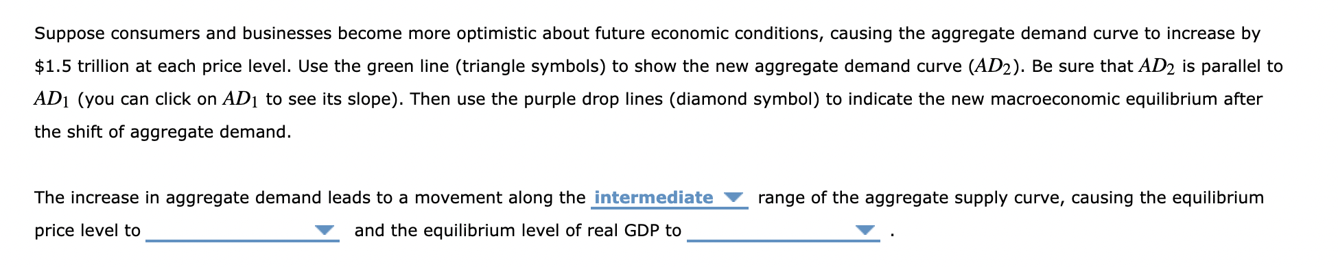
Suppose consumers and businesses become more optimistic about future economic conditions, causing the aggregate demand curve to increase by \( \$ 1.5 \) trillion at each price level. Use the green line (triangle symbols) to show the new agregate demand curve ( \( \left.A D_{2}\right) \). Be sure that \( A D_{2} \) is parallel to \( A D_{1} \) (you can click on \( A D_{1} \) to see its slope). Then use the purple drop lines (diamond symbol) to indicate the new macroeconomic equilibrium after the shift of aggregate demand. The increase in aggregate demand leads to a movement along the range of the aggregate supply curve, causing the equilibrium price level to and the equilibrium level of real GDP to