Home /
Expert Answers /
Economics /
the-following-graph-represents-the-demand-and-supply-for-blinkies-an-imaginary-product-the-black-pa481
(Solved): The following graph represents the demand and supply for blinkies (an imaginary product). The black ...
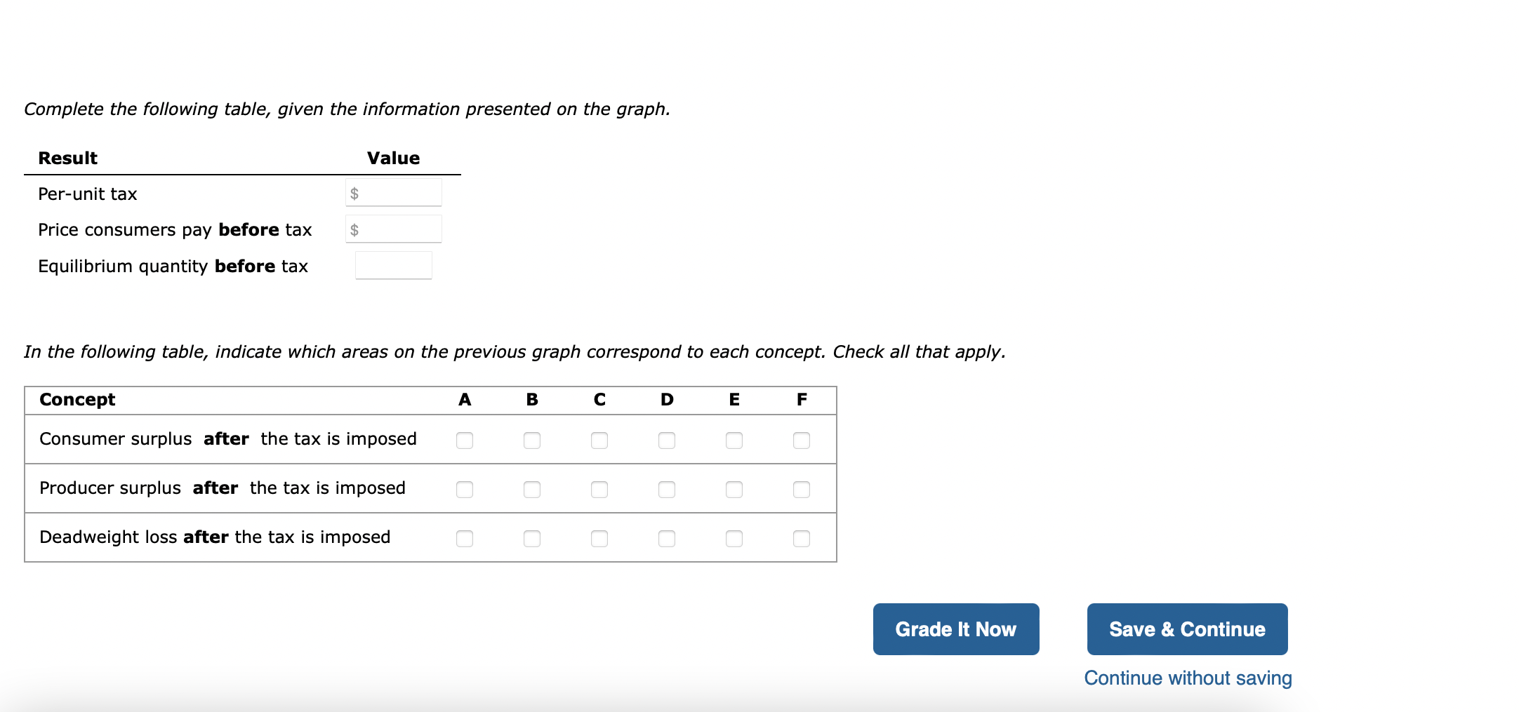
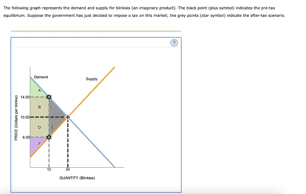
The following graph represents the demand and supply for blinkies (an imaginary product). The black point (plus symbol) indicates the pre-tax equilibrium. Suppose the government has just decided to impose a tax on this market; the grey points (star symbol) indicate the after-tax scenario. PRICE (Dollars per blinkie) QUANTITY (Blinkies) Demand Supply A B C D E F 10.00 24 6.00 14.00 12 Complete the following table, given the information presented on the graph. Result Value Per-unit tax Price consumers pay before tax Equilibrium quantity before tax In the following table, indicate which areas on the previous graph correspond to each concept. Check all that apply. Concept A B C D E F Consumer surplus after the tax is imposed Producer surplus after the tax is imposed Deadweight loss after the tax is imposed
The following graph represents the demand and supply for blinkies (an imaginary product). The black point (plus symbol) indicates the pre-tax equilibrium. Suppose the government has just decided to impose a tax on this market; the grey points (star symbol) indicate the after-tax scenario.
Complete the following table, given the information presented on the graph. In the following table, indicate which areas on the previous graph correspond to each concept. Check all that apply.