Home /
Expert Answers /
Economics /
the-following-graph-plots-the-marginal-cost-curve-average-cost-curve-and-total-cost-curve-for-a-fi-pa254
(Solved): The following graph plots the marginal cost curve, average cost curve, and total cost curve for a fi ...
The following graph plots the marginal cost curve, average cost curve, and total cost curve for a firm operating in a competetive market for snapback hats.
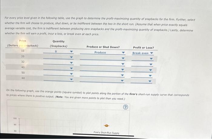
For every price level given in the following table, use the graph ti determine profit maximizing quantity of snapbacks for the firm. further, select whether the firm will choose to peoduce, shut down, or be indifferent between the two in the short run. lastly, determine whether the firm will earn a profit, incur a loss, or break even at price.
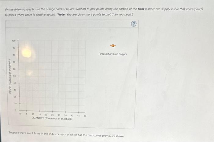
on the following graph, use the orange points to plot along the portion of the firms short run supply curve that corresponds to prices where there is positive output.
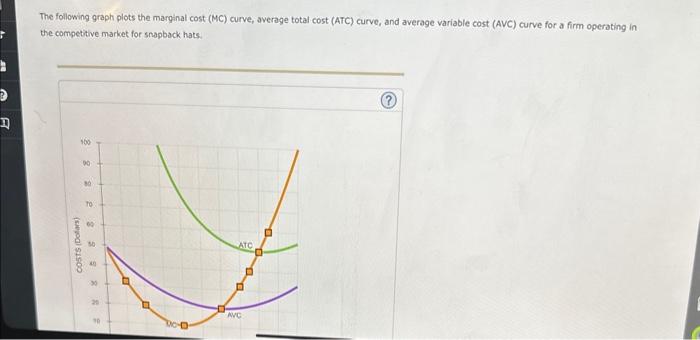
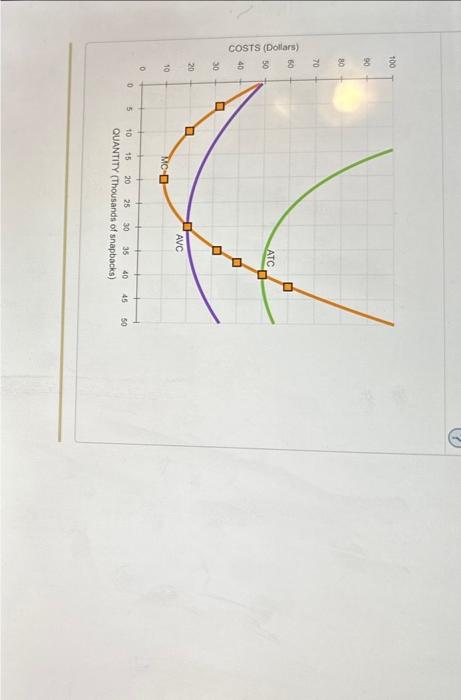
The following graph plots the marginal cost (MC) curve, average total cost (ATC) curve, and average variable cost (AVC) curve for a firm operating in the competitive market for snapback hats.
For every price level given in the following table, use the graph to defermine the profit-maximizing quantity of snapbacks for the firm. Further, select whether the firm will choose to produce, shut down, or be indifferent between the two in the short run. (Assume that when price exactly equals average variable cost, the firm is indifferent between producing zero snapbacks and the profit-maximizing quantity of snapbacks.) Lastly, determine whether the firm will eam on profit, incur a loss, or break even at each price. On the following graph, use the orange points (square symbol) to piot points along the portion of the firm's short-run supply curve that corresponds to prices where there is positive output. (Note: You are given more points to plot than you need.)
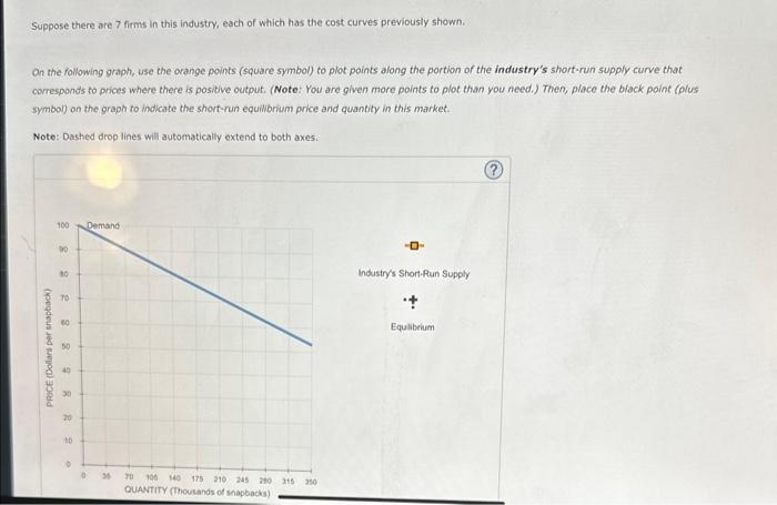
On the following graph, use the orange points (square symbol) to plot points along the portion of the firm's short-run supply curve that corresponds to prices where there is positive output. (Note: You are given more points to plot than you need.) Suppose there are 7 firms in this industry, each of which has the cost curves previously shown.
Suppose there are 7 firms in this industry, each of which has the cost curves previously shown. On the following graph, use the orange points (square symbol) to plot points afong the portion of the industry's short-run supply curve that comesponds to prices where there is positive output. (Note: You are given more points to plot than you feed.) Then, place the biack point (olus. symbol) on the graph to indicate the short-run equilibrium price and quantity in this market. Note: Dashed drop lines will automatically extend to both axes: