Home /
Expert Answers /
Statistics and Probability /
graph-a-and-graph-b-both-show-the-number-of-passengers-in-thousands-of-passengers-who-flew-out-o-pa342
(Solved): Graph A and Graph B both show the number of passengers, in thousands of passengers, who flew out o ...
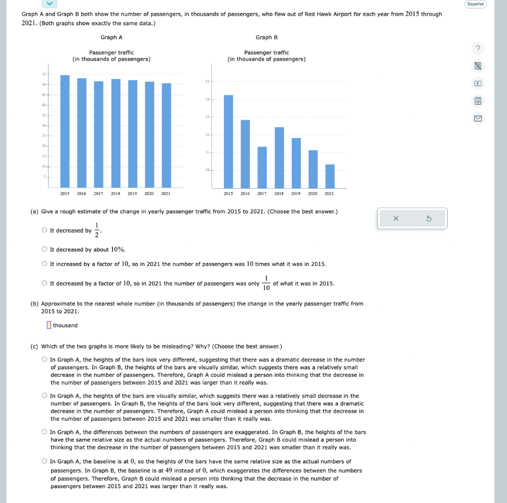
Graph A and Graph B both show the number of passengers, in thousands of passengers, who flew out of Red Hawk Airport for each year from 2015 through 2021. (Both graphs show exactly the same data.) (a) Give a rough estimate of the change in yearly passenger traffic from 2015 to 2021. (Choose the best answer.) It decreased by \( \frac{1}{2} \) It decreased by about \( 10 \% \). It increased by a factor of 10, so in 2021 the number of passengers was 10 times what it was in \( 2015 . \) It decreased by a factor of 10 , so in 2021 the number of passengers was only \( \frac{1}{10} \) of what it was in \( 2015 . \) (b) Approximate to the nearest whole number (in thousands of passengers) the change in the yearly passenger traffic from 2015 to \( 2021 . \) thousand (c) Which of the two graphs is more likely to be misleading? Why? (Choose the best answer.) In Graph A, the heights of the bars look very different, suggesting that there was a dramatic decrease in the number of passengers. In Graph B, the heights of the bars are visually similar, which suggests there was a relatively small decrease in the number of passengers. Therefore, Graph A could mislead a person into thinking that the decrease in the number of passengers between 2015 and 2021 was larger than it really was. In Graph A, the heights of the bars are visually similar, which suggests there was a relatively small decrease in the number of passengers. In Graph B, the heights of the bars look very different, suggesting that there was a dramatic decrease in the number of passengers. Therefore, Graph A could mislead a person into thinking that the decrease in the number of passengers between 2015 and 2021 was smaller than it really was. In Graph A, the differences between the numbers of passengers are exaggerated. In Graph B, the heights of the bars have the same relative size as the actual numbers of passengers. Therefore, Graph B could mislead a person into thinking that the decrease in the number of passengers between 2015 and 2021 was smaller than it really was. In Graph A, the baseline is at 0 , so the heights of the bars have the same relative size as the actual numbers of passengers. In Graph B, the baseline is at 49 instead of 0 , which exaggerates the differences between the numbers of passengers. Therefore, Graph B could mislead a person into thinking that the decrease in the number of passengers between 2015 and 2021 was larger than it really was.
Expert Answer
ANSWER : a) Give a rough eatimate of the change in yearly passenger traffic from 2015 to 2021 It decreased by about 10% From the given graph A, it is clear that the no. of passengers in 2015 was about 45000, while it was a little bit over 40,500 in 2