Home /
Expert Answers /
Statistics and Probability /
construct-parallel-boxplots-boxplots-displayed-side-by-side-to-visualize-the-hate-crimes-per-100-0-pa797
(Solved): Construct parallel boxplots (boxplots displayed side-by-side) to visualize the hate crimes per 100,0 ...
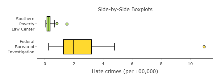
Construct parallel boxplots (boxplots displayed side-by-side) to visualize the hate crimes per 100,000100,000 people as reported by the FBI and the hate crimes per 100,000100,000 people as reported by the Southern Poverty Law Center (SPLC). Note: You can ignore states with missing data.
The FBI data describes the average annual hate crime rates from 2010-2015. The SPLC data describes the hate crime rate in 2016 between November 9-18.
Question:
Part A: Compare the two distributions using your visualization.
Part B: Why do you think these two distributions are so different? Explain.