(Solved): Analyze the graphs below. Carefully study the horizontal and vertical axis of the graphs. Describe i ...
Analyze the graphs below. Carefully study the horizontal and vertical axis of the graphs. Describe in detail the trends of the three parameters in the two figures (carbon dioxide concentration in atmosphere, anthropogenic carbon dioxide emissions, temperature deviation) and the timing of the trends. Include in your description the similarities and differences between the trends of the three parameters and an explanation for the trends. What conclusions can you draw from your observations? Justify your conclusions.
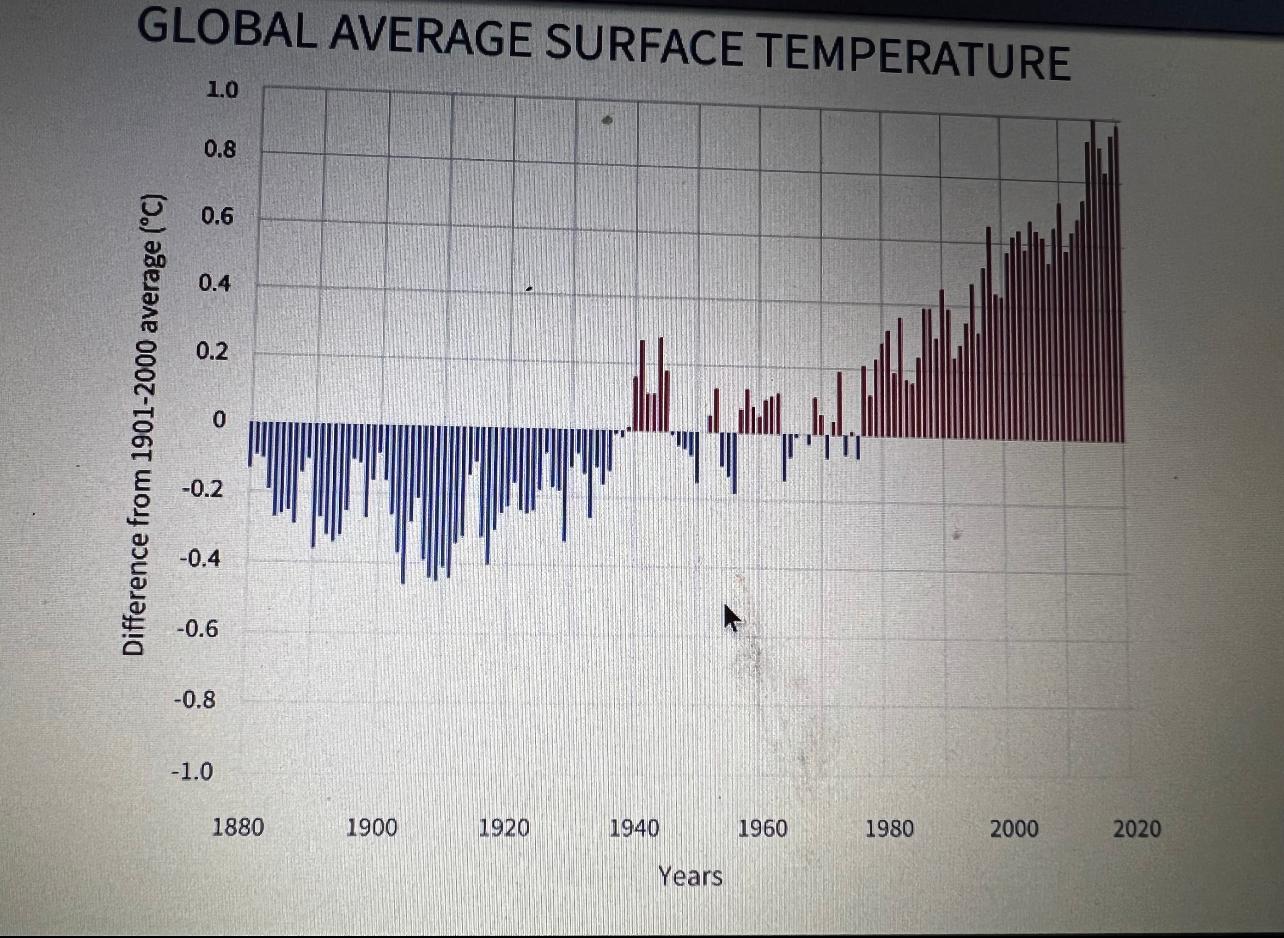
Figure 2. Global surface temperature. Bars show deviation of annual temperature from average global temperature for the 20th century. Blue bars show years that the annual temperature was below the average for the century, red bars mark years when the temperature was above the average for the century
Expert Answer
The graph can be divided into three parts, one is from 1880 to 1940 when the annual temperature was lower than the century average, second is from 1941 to 1956 when there is a constant fluctuation in the temperature difference and the last one is fro