Home /
Expert Answers /
Statistics and Probability /
2-on-your-calculator-do-a-linear-regression-stat-calc-b-for-these-different-combinations-dis-pa319
(Solved): 2. On your calculator, do a linear regression (STAT CALC B) for these different combinations: - Dis ...
2. On your calculator, do a linear regression (STAT CALC B) for these different combinations: - Distance vs. In(Year) (L1 vs. L4, if you entered the data as directed above) - Ln(Distance) vs. Year (L3 vs. L2, if you entered the data as directed above) - Ln(Distance) vs. Ln(Year) (L3 vs. L4, if you entered the data as directed above) (Note that the explanatory variable is always some form of "Distance.") To get the most out of this Assignment, look at a scatterplot of each of these combinations. Which transformation yields the highest correlation coefficient (Pearson's \( r \) )? Sketch a scatterplot of this transformation and show the least-squares line. What is the value of \( r \) and \( r^{2} \) for that transformation, and what regression equation does it yield? ( 3 points) (Hint: Remember to include "In" on the variables in your regression equation that have been transformed.) 3. Using the regression equation fromithe previous question that best fits the data, place the values of the residuals into L5. In case you forgot how to do this: Press STAT 1 , highlight L5, in the data list window and press then press [LIST], select RESID, and press ENTER] ENTER. Create a residual plot on your calculator and interpret it; you don't need to draw the plot. (Note: You'll probably need to turn off the plot in \( Y 1 \) to display the scatterplot correctly.) (2 points)
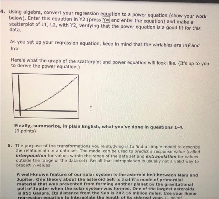
Using algebra, convert your regression equation to a power equation (show your work below). Enter this equation in \( Y 2 \) (press \( Y= \) and enter the equation) and make a scatterplot of \( L 1, L 2 \), with \( Y 2 \), verifying that the power equation is a good fit for this data. As you set up your regression equation, keep in mind that the variables are \( \ln \hat{y} \) and \( \ln x \). Here's what the graph of the scatterplot and power equation will look like. (It's up to you to derive the power equation.) Finally, summarize, in plain English, what you've done in questions 1-4. (3 points) 5. The purpose of the transformations you're studying is to find a simple model to describe the relationship in a data set. The model can be used to predict a response value (called interpolation for values within the range of the data set and extrapolation for values outside the range of the data set). Recall that extrapolation is usually not a valid way to predict \( y \)-values. A well-known feature of our solar system is the asteroid belt between Mars and Jupiter. One theory about the asteroid belt is that it's made of primordial material that was prevented from forming another planet by the gravitational pull of Jupiter when the solar system was formed. One of the largest asteroids is 951 Gaspra. Its distance from the Sun is \( 207.16 \) million miles. Use your linear
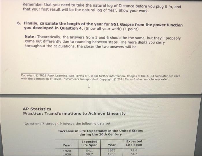
Remember that you need to take the natural \( \log \) of Distance before you plug it in, and that your first result will be the natural log of Year. Show your work. Finally, calculate the length of the year for 951 Gaspra from the power function you developed in Question 4. (Show all your work) (1 point) Note: Theoretically, the answers from 5 and 6 should be the same, but they'll probably come out differently due to rounding between steps. The more digits you carry throughout the calculations, the closer the two answers will be. Copyright (8 2021 Apex Leaming. See Terms of Use for further information. Images of the TI-84 calculator are used with the permission of Texas Instruments Incorporated. Copyright \& 2011 Texas Instruments Incorporated. AP Statistics Practice: Transformations to Achieve Linearity Questions 7 through 9 involve the following data set. Increase in Life Expectancy in the United States during the 20th Century
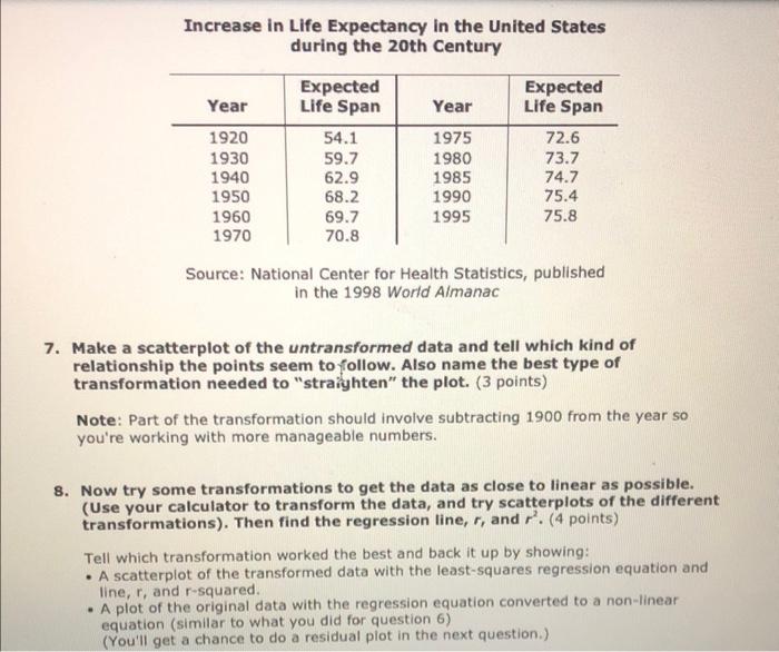
Increase in Life Expectancy in the United States during the 20th Century Source: National Center for Health Statistics, published in the 1998 World Aimanac 7. Make a scatterplot of the untransformed data and tell which kind of relationship the points seem to follow. Also name the best type of transformation needed to "straighten" the plot. (3 points) Note: Part of the transformation should involve subtracting 1900 from the year so you're working with more manageable numbers. 8. Now try some transformations to get the data as close to linear as possible. (Use your calculator to transform the data, and try scatterplots of the different transformations). Then find the regression line, \( r \), and \( r^{2} \). (4 points) Tell which transformation worked the best and back it up by showing: - A scatterplot of the transformed data with the least-squares regression equation and line, \( r \), and \( r \)-squared. - A plot of the original data with the regression equation converted to a non-linear equation (similar to what you did for question 6) (You'll get a chance to do a residual plot in the next question.)
Here are some hints: - Look at the curve and think about what kind of relationship (equation) could have made such a curve (this is what you already did in question 7). - Then try the kind of transformation that should work for that kind of curve. (See the Summary of Common Transformations at the beginning of this document.) If your first guess doesn't work, try others. - More than one transformation will yield a good model; choose the one with the strongest value of \( r \). - If your transformation (the one that seems to work the best) doesn't match your answer for question 7, you may want to revise your answer for question 7! Copyright (?) 2021 Apex Leaming. See Terms of Use for further information. Images of the T1-84 calculator are used with the permission of Texas Instruments Incorporated. Copyright @ 22011 Texas Instrurnents Incorporated. AP Statistics Practice: Transformations to Achieve Linearity Type of transformation: Linear regression equation for transformed data: \( r \) and \( r^{2} \) : Scatterplot of the transformed data with the least-squares regression equation and line, \( r \), and \( r^{2} \). Plot of the original data with the regression equation converted to a non-linear equation (similar to what you did for question 6).
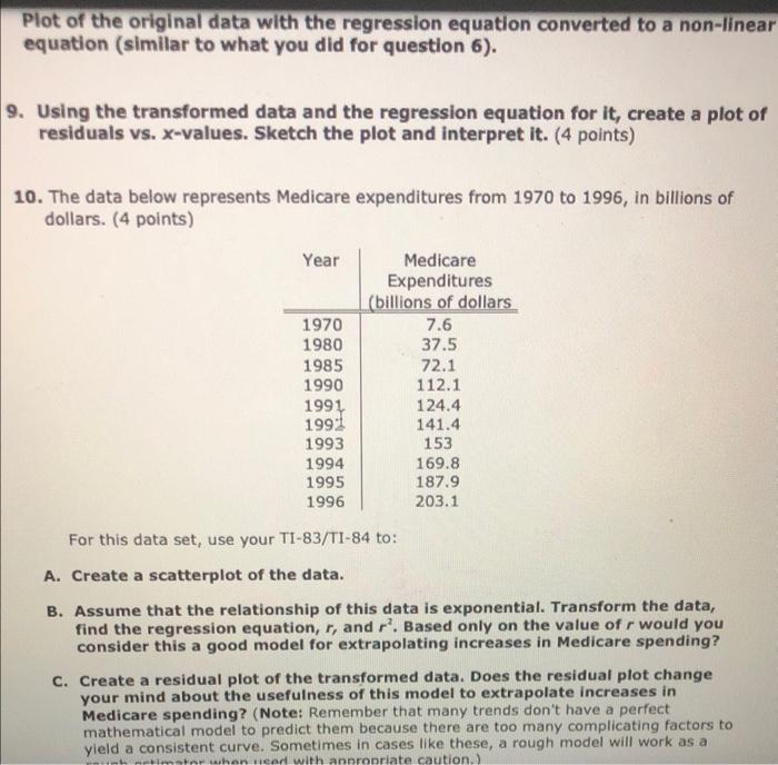
Plot of the original data with the regression equation converted to a non-linear equation (similar to what you did for question 6). 9. Using the transformed data and the regression equation for it, create a plot of residuals vs. \( x \)-values. Sketch the plot and interpret it. (4 points) 10. The data below represents Medicare expenditures from 1970 to 1996 , in billions of dollars. (4 points) For this data set, use your TI-83/T1-84 to: A. Create a scatterplot of the data. B. Assume that the relationship of this data is exponential. Transform the data, find the regression equation, \( r \), and \( r^{2} \). Based only on the value of \( r \) would you consider this a good model for extrapolating increases in Medicare spending? C. Create a residual plot of the transformed data. Does the residual plot change your mind about the usefulness of this model to extrapolate increases in Medicare spending? (Note: Remember that many trends don't have a perfect mathematical model to predict them because there are too many complicating factors to yield a consistent curve. Sometimes in cases like these, a rough model will work as a
Expert Answer
To convert a regression equation to a power equation, one can take the natural logarithm of both sides of the equation and then rewrite it in the form